So I based my take on musical history on Ishkur's model, big, concentric rings that mark each decade, beginning with everything before the 40's, extending into the end of this decade. Music's a fuzzy business, you can't create clear-cut boundaries between genres and the labels given to a genre can change over the decades when people look back to older music. Also, I wanted to show music more or less like a web of influences; just like disco got it's flavours from funk, soul and apparently a bit of salsa, funk roots itself in psychedelic rock, soul (again) and jazz. I knew though that I'd have to work on the layout, otherwise it'd be so messy and hard to read that nobody would bother. It's tricky, specially when after the sixties, music exploded into a myriad of styles.
Perhaps too I should have looked at some other examples before embarking on a journey only a few nutty people embark. I looked around the web and found some pretty interesting ways other people have been doing similar things. How does one represent something fuzzy, subjective and ever-changing like music? Maybe the Information Is Beautiful blog has a few things to teach us about clearly visualising information. Here are a few maps from around the web (click on images) :
 So, to begin, I found this one here focusing on the relationships between different kinds of electronic dance music. It leans heavily on the artistic side, but that's not bad at all. Sadly, it's an image I found aaages ago and kept it because I found it pretty, but I never knew out who made it or where I could find it again. But for the meantime, we can marvel at the psychedelic colour mixtures and funky lines linking each genre-bubble.
 INTONE, a music-based marketing company has this particularly interesting layout, genres are like stops on the London underground system, connected to each other by colours representing a similar sound or evolution. I quite like it because of its simplicity; it's easy to read and make immediate connections, some dating to thousands of years (see ''The Drum'', the big black circle bottom-left). Definitely, a good deal of research and careful design planning went into this. It's good for those making the most evident connections, but if you're deep into music connections, it might be a bit too simplistic.
 On a very similar approach, the blokes at The Guardian attempted to map out 100 years of musical evolution, again on a London-tube underground map. This one differs on its approach in that it has artist names instead of styles of music, but the different 'paths' in different colours carry different styles of music. This one focuses solely on western music, particularly Anglo-American music, so don't go looking for merengue, salsa, shibuya-kei or kwaito. Allegedly, this focus was to prevent the editor's head from exploding. Yes, it would look awful with so much. I found it linked here.
 This next, the ''Tourist Map of Music'', impressed me. Unlike all the previous ones, it's actually interactive. You type the name of a band/artist, and in a minimalist blue screen the name you typed appears, and around it the names of similar artists will gravitate and organise themselves, the closer they are to the central name, the bigger the likelihood that fans of the artist/band you typed listen to that too. Pretty awesome! How do they do that?!? I think that with a bit of streamlining, this could definitely be the tool of future music consumers helping them to discover new sounds, because of its ease of use. In the words of the creator, Marek Gibney, ''Gnod'', the system on which this monster thing works, ''is my experiment in the field of artificial intelligence. Its a self-adapting system, living on this server and 'talking' to everyone who comes along. Gnods intention is to learn about the outer world and to learn 'understanding' its visitors. This enables gnod to share all its wisdom with you in an intuitive and efficient way. You might call it a search-engine to find things you don't know about.''
These following two are also interactive and actually let you listen to music in an interactive
 map-like way. The first one, Musicovery, is everything Yahoo! Radio wasn't. In a deceptively simple set of controls (shown to the left), you can navigate through the emotional and energetic spectrum that is music, through mood (positive to negative) and amount of energy in the music.
 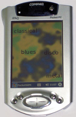 You can also browse through decades and select genres to be more nit-picky. There are a few other features (like a search bar which doesn't actually show what you're looking for) and other things which you'll have to figure out :D. This last 'map' on the right, the SOM-enhanced JukeBox system (SOMeJB) analyses your mp3 files and interprets their sonic properties, namely dynamic range and yeah, how it sounds. Then as seen here, it plots different areas for each style, arranging them according to sound related to each other. That's why classical music and heavy metal are on opposite extremes. See how you can make playlists interactively, taking these paths through different soundscapes!
 (Click for higher resolution and all that nice stuff)
Finally, I could have probably learned a few lessons from the examples above before embarking on the fuzzy history of western music and its genres, but I was trying to be a bit 'different'. Yes, lot's o' nodes and lines connecting stuff, like neurones in a brain, though both frighteningly complicated and somehow organised. Also, I marked all I saw fit into large categories into different colours. Red for rock music, green for jazz. the usual stuff. Yellow for break-beat (that kind of music that was born when hip-hop artists stringed different drum breaks from old funk records and gave birth to a billion things, and blue for 4-to-the-floor, which is simply that basic rhythm where the kick marks the 4 beats in a bar, which was popular in rock but really took off when disco music became the bomb. Also, you might be wondering why in my map, punk (in red) gave birth to this thing I call ''Oh no, you didn't!''. Yeah, I'm being biased there, but I don't think any serious person thinks great things about crunkcore and emo... I'll leave that for a future post on punk music.
''Out on the edges they're mixin' the colors some they don't like it but me, I don' t mind in every city they' re mixing the colors different shades for the whole countryside''
Mixin' The Colors - Iggy Pop
Edit:
Apparently this cool map here escaped my search: Map of Metal
A really cool flash-based map of the history of heavy metal and it's different genres, loaded with tons of music samples and descriptons. Also, it looks like jeans, leather, badass buttons and chains. What else could you ask for?
No hay comentarios:
Publicar un comentario